HTML 5 Picture Element
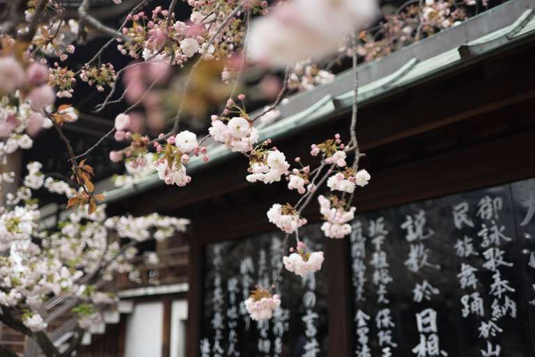
A Responsive Image
This is a responsive image, using the <picture> element.
The <picture> element let’s you take advantage of responsive images. One of the key benefits is that users only download images at a size that matches their device. There’s no need to download a 1200px wide image to a smartphone with a screen that’s 320px wide, right?
How to
In order to add a responsive image to your post, you first need to add an image variable in your front matter like this:
Then you call the picture.html include file, using the following Liquid tag:
This handy include let’s you not have to write the following code everytime. There is also another include file, picture_logic.html, that is called on the home page, which will use this same image on the post’s card entry.
{%- if page.image -%}
{%- assign f = page.image | split: '.' -%}
{%- assign img_path = site.baseurl | append: "/assets/images/responsive/" -%}
  <picture>
    <source media="(max-width: 576px)"
    srcset="
      {{ img_path | append: f[0] | append: relative_url }}-sm-1x.webp 1x,
      {{ img_path | append: f[0] | append: relative_url }}-sm-2x.webp 2x
    "
    type="image/webp"
    >
    <source media="(max-width: 576px)"
    srcset="
      {{ img_path | append: f[0] | append: relative_url }}-sm-1x.jpg 1x,
      {{ img_path | append: f[0] | append: relative_url }}-sm-2x.jpg 2x
    "
    type="image/jpeg"
    >
    <source media="(max-width: 768px)"
    srcset="
    {{ img_path | append: f[0] | append: relative_url }}-md-1x.webp 1x,
    {{ img_path | append: f[0] | append: relative_url }}-md-2x.webp 2x
    "
    type="image/webp"
    >
    <source media="(max-width: 768px)"
    srcset="
    {{ img_path | append: f[0] | append: relative_url }}-md-1x.jpg 1x,
    {{ img_path | append: f[0] | append: relative_url }}-md-2x.jpg 2x
    "
    type="image/jpeg"
    >
    <source media="(min-width: 769px)"
    srcset="
    {{ img_path | append: f[0] | append: relative_url }}-xl-1x.webp 1x,
    {{ img_path | append: f[0] | append: relative_url }}-xl-2x.webp 2x
    "
    type="image/webp"
    >
    <source media="(min-width: 769px)"
    srcset="
    {{ img_path | append: f[0] | append: relative_url }}-xl-1x.jpg 1x,
    {{ img_path | append: f[0] | append: relative_url }}-xl-2x.jpg 2x
    "
    type="image/jpeg"
    >
    <img
      srcset="
        {{ img_path | append: f[0] | append: relative_url }}-sm-1x.jpg 576w,
        {{ img_path | append: f[0] | append: relative_url }}-md-1x.jpg 768w,
        {{ img_path | append: f[0] | append: relative_url }}-xl-1x.jpg 1440w"
      src="{{ img_path | append: f[0] | append: relative_url }}-md-1x.jpg"
      alt="{{ page.title }}"
      class="figure-img rounded"
      type="image/jpeg"
      >
  </picture>
{%- endif -%}
Inspiration
Maciej Nowakowski has done an awesome writeup on Medium about this: A Guide to Responsive Images with Ready-to-Use Templates.
His guide was indespensible in creating this as well as the responsive Jumbotron background images.
While it might seem a bit excessive to create a bunch of images like this, I think this comment sums it up nicely.
Why generate 12 versions of the same image when just 2 media-queries do the job? The users won’t notice... But Google will.
Can I Use?
The <picture> element is supported fairly well by modern browsers. Internet Explorer (IE) is sadly not very modern. There is a polyfill that I might add to support IE if anyone sends me enough crying emojis from their machine running Windows Vista.